Monday, September 28, 2009

Postal Presents - Curve Organiser

Instruction Sheet:


Cutting Diagram:


Exploded View:
 Isometric Drawing:


Rationale:
This project began with the identification of the need for a pencil and pen organiser, which could bring pleasure and comfort to its user. Unlike similar products, I was looking to design something, which would not be an intrusive eyesore on the desktop. Sent as a gift, such an object could provide enjoyment in many forms both due to its functional and aesthetic qualities.

It’s this balance of function and aesthetics, which sets the Curve Organiser apart from the other common desktop organisers. The Curve is designed to organise stationery horizontally rather than vertically. This allows for ease of use when searching for certain objects. This also gives the user the ability to store their stationery in a variety of positions such as a North-South orientation or even East-West.

A variety of different design solutions were tested through both models and sketches. The array of ideas compiled allowed for experimentation and research, which in turn helped decide on the target markets favourite design. In the end, this specific design was chosen for its balance and simplicity. The smooth curved form of the organiser makes it inviting and pleasant. The user is enticed into using it and wants to have it around for others to see. It’s a gift that the receiver can be proud to show off.

The pleasure experienced during the construction of the Curve comes from the fact that the receiver of the gift sees the product take shape a little more with each and every piece. Over time the 22 pieces come together to form one unified product. Even once constructed, the Curve Organiser continues to be pleasurable as it can be used day after day after day.

The Curve is constructed using laser cut acrylic perspex and extruded perspex rod. The 6mm thick Perspex allows the main body of the Curve to fit within a C4 envelope in its 2D form. This material also provides for a sturdy construction, which is more than strong enough for the specified task. Laser cutting was chosen as the process to make this model as it’s very accurate and suits the design perfectly. By submitting a .DXF file produced in AutoCAD I was able to receive the results quickly and with a far greater level of precision than I would have been able to produce myself.

The Curve Organiser is a great example of putting a two-dimensional sheet material to use, in order to form a smooth, free flowing three-dimensional product, which can be enjoyed every single day.

Peer Comment:
Kiran Kashyap
Emily Soares
Nicholas Walker
Stanley Wong
Alfred Boyadgis

Finished Product:


Monday, September 21, 2009

Ross Lovegrove: The Power and Beauty of Organic Design

To be honest, I got really tired of listening to the self-professed “Captain Organic” talking about himself and his work and his studio. He may be good at what he does, but I can think of many better ways to spend my time. I do however admire his ambition and his method of instinctive design. He stated that “instinct plays a huge role in design” and I couldn’t agree more. In some cases, our instinct will tell us what’s best and in my opinion, maybe some times we should leave it at that and move on. Sometimes, adding thought to an idea can only lessen its aesthetic appeal and functional properties.

Of the products displayed within the video, Ross Lovegroves water bottle had to be my favourite. When first seeing his “representation of water” I laughed a little and couldn’t help but wonder where he was taking me. “What could these squiggly lines on a page possibly lead to?” The journey however, was fascinating. Seeing that shape come to life and to eventually form the final product was incredible. His bottle really does manage to capture water in its most beautiful, organic state. 

Nature designs with necessity in mind. It liberates form and strips it to the bare essentials. Lovegroves scientific approach to design and its form was enlightening. He can take something like a molecular structure and use it as the basis for a piece of furniture, which fits necessity first and foremost. There are no added extras or decorations. It’s just the bare essentials, as if it were created through millions of years of evolution like the dinosaurs. “I make organic things, which are essential.”

For industrial designers, this video provides an insight into the direction we should be heading in terms of design and material choices as resource levels dip to new lows. Organic design has the ability to leave a smaller environmental footprint than other methods of design while still producing designs which are the same, if not more beautiful. It’s great to see these pioneers such as Ross who are looking into Biopolymers and even foodstuffs and forcing them upon multinational corporations (even if they ignore him).

“Could we be manufacturing from food stuffs in the future?” My fingers are crossed and I’m hoping the answer is “Yes”. We’ll have a delicious future on our hands (and faces) if Captain Organic has his way.

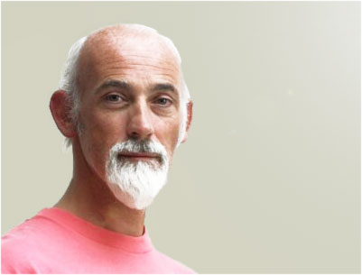
Image: http://www.designboom.com/eng/interview/lovegrove/dbportrait.jpg

Monday, September 14, 2009

Bad Design


The NOKIA 6500 Slide phone was chosen for the bad design task due to an improperly labeled and badly position power button. To the inexperienced (and experienced) mobile phone user, the power button appears to not exist as it lacks the design features to draw attention. Many users would expect to see a power button along the top ridge of the phone, however the only button to be found there removes the rear cover. The actual power button, in fact is combined with the end call button, however no design effort was made to show this. 

My proposed change involves simply placing a separate power button on the top of the phone. The issue of it not standing out amongst other buttons would be solved by printing a power logo on the button in red to grab the users attention.

Monday, August 31, 2009

Experience Enrichment - Finger Mug

Mood Board:


Product Poster:


Technical Drawings
:


Rationale
:
The finger mug is something new. It’s a coffee mug designed to improve both the emotional and physical connection between the product and its user, all the while looking stylish and well suited for an office environment. This product is a transformation of an everyday object into something, which gives a more pleasurable experience and creates a personalised relationship with its user.

A product such as this is targeted towards Males between the ages of 30 and 50 years. The ones who leave home 5 days a week to work in a 9 - 5 office job. It’s this time away from home combined with early mornings late nights and long commutes, which can lead to a boring, lonely lifestyle. This product, although similar to a regular coffee mug, has the ability to make positive changes in its users day-to-day life without drastic aesthetic alterations.

While keeping to the standard dimensions of a coffee mug, a small change in the overall shape of the finger mug allows for a more dynamic shape. One, which seems to belong on the desk of a dynamic businessman. It’s this dynamicity, which makes the mug such a great attention grabber and talking point.

The main difference in texture between the smooth, glossy finger mug and a conventional coffee mug is the fingerprints, which allow for an improved emotion and physical connection while also enhancing the aesthetic appeal of the mug.

In order to fit in with its formal business surrounding the mug is coloured entirely white and is made using ceramics like traditional coffee mugs. The colour choice allows for it to blend in with ordinary mugs, however the shadows cast by the fingerprints catch the attention of any onlookers. The use of ceramics is common in coffee mugs as they provide insulation from the hot drink within. To aid this insulation the finger mug has double the wall thickness of a normal coffee mug to better protect the hands of the user. A question I often receive is “how will you drink from a mug if there is no handle and it’s too hot to hold?” My response to that is that “if it’s too hot to hold then would you really want to put it in your mouth?”

The product is designed to please the user physically by being solid and weighted while still minimal in order to suit an office setting while still allowing the emotional connection of holding a weighted object, which doesn’t feel as though it can be easily crushed.

Socially the product is designed to be a stylish talking point. This is aided both by the dynamic lines of the mug and the new styling, which I believe to be a big leap from traditional mugs.

To please the target market psychologically, the mug is simple and easy to use while still being exciting and enticing. The fingerprints give the users (or a bystander) the need to reach out and feel the mug. To experience the connection it offers.

In an ideological sense, the user is happy with the product as it looks modern with its sleek design while still keeping with current design trends and not being too radical. This allows this everyday object to be a centrepiece within the modern office without having the same huge visual affect experienced by a painting or sculpture.

The finger mug not only enriches the experience of drinking coffee through improving emotional and physical connections, but it allows for a coffee mug to be something different. It’s something more than just a mug on a desk beside your keyboard. It’s a talking point and a way of getting a little more attention around the office while you’re missing home.

Peer Comments:
Danielle Taouk
Stephen Mesa
Shan Shan Wang
Jonathan Biet
Nina Harcus

Presentation:


Sunday, August 23, 2009

Yves Behar: Creating Objects that tell stories


“Storytelling has been a really strong influence in my work”. - Yves Behar.

After leaving design school Behar began questioning what was truly necessary. A good example of this being the presence of the num lock key on today’s keyboards despite the fact that many people have no idea what its purpose is. He noticed that the guys in Silicon Valley we’re not interested in changing what’s on the inside and more rather wanted to make changes to the outside. They only wanted to create beauty on the outside of the box. This lead Behar to move off on his own. His interest was to design the entire human experience in to a product and not just the exterior. He aimed to make technology humble in an attempt to help the user interact with the product.

The Y water bottle was definitely a stand out favourite for me. I could not see a single thing wrong with it. The fact that this healthy alternative to soft drink can be served in this creative packaging, then after use become a collectible toy is something that I love. If this product had been around during my childhood, I’m sure my drinking habits would have been far healthier. I know that if I got my hands on one or two of those bottles and saw the potential I’d just want to keep collecting and creating.

The shape shifting light fixture really helped me to see the closing gap between technology and its user. It’s incredible that simple by touching a small screen and creating a personalised shape, the light would rearrange itself to fit the users preference.

In my opinion, it’s important for designers to see this video, as they need to understand that design isn’t simply making something look better. Design is the glue which beings a variety of values together in order to form the products overall value. The
Jawbone bluetooth headset for example was designed from the ground up. It had to not only work well but in order to appeal to a more stylish market, it had to look like it belonged on the side of your face. This video highlights design not only from an aesthetic aspect but also from technical aspect. It helps us understand all the work that needs to go into a product during the design process.

Image:
http://farm1.static.flickr.com/232/519394574_1bce663eb2_o.jpg

Video:
http://www.youtube.com/watch?v=QGn8F4j6pH8